Story
Camille lives with Moka, her calm yet spirited Akita. Between work, walks, and social outings, she wants the best for her dog : a healthy, balanced diet tailored to his specific needs. Yet, she often feels overwhelmed by the many options and conflicting advice available.
One evening, while searching for reliable information on canine nutrition, Camille discovers Woof & Green, an app that makes feeding dogs healthy and balanced meals simple. She can create ingredient-based meal plans, check compatibility, and easily track Moka’s meals.
First Experience : Camille enters Moka’s dietary preferences and restrictions into the app. She discovers simple, wholesome recipes based on fresh, high-quality ingredients. Curious, Moka sniffs every new preparation as if testing it personally.
Daily Integration : With Woof & Green, Camille no longer worries about whether Moka is eating healthily. The app suggests alternatives if an ingredient is missing and allows her to plan the week efficiently and effortlessly.
Result : Camille feels confident and relaxed. She saves time while providing Moka with a balanced and varied diet. Their bond strengthens, and city life becomes more harmonious for both of them.
What I worked on :
Brand Identity refresh + Product (app) UI & UX + Design system development + Icon pack design
Woof & Green
Natural Dog Food Application
Problem
Dog owners struggle to find clear and reliable information about food ingredients for their pets.
Project Goals
Designed an app for Woof & Green that allows users to easily search and understand dog food ingredients.
01 / Empathize - Exploring the user's needs
Research approach
Competitive analysis
Research approach
I conducted interviews to understand Woof & Green app users and their needs. A primary user group identified through research: dog owners who care about their pets' health, but find it difficult to find reliable information on food ingredients. This group of users confirmed initial assumptions about the need for a dedicated app, but the research also found that lack of knowledge about canine nutrition and difficulty comparing ingredients were major challenges for these users.
Competitive Analysis
To deepen my understanding of the dog food market and user expectations, I conducted a competitive analysis.
This analysis focused on 5 direct and indirect competitors offering dog food.
The insights gained highlighted common design patterns, industry trends, and areas where existing apps struggle to present content effectively.

03 / Ideate - Creating the framework
App plan
Paper wireframes
The app plan was designed to :
Ingredient Search
Adding Ingredients to a List
Ingredient list management
Simple and intuitive interface
Wireframes
Taking the time to write out the iterations of each screen of the application on paper ensured that the elements that were integrated into the digital wireframes would be well suited to solving user problems.
For the home screen, I prioritized a quick and easy search process to help users save time.


Usability test plan and goal :
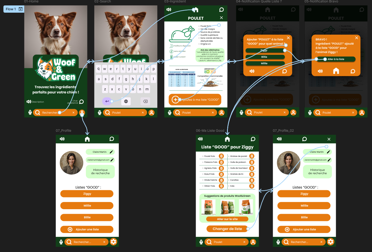
Using the full set of digital wireframes, I created a low-fidelity prototype. The main user flow I connected was to search for an ingredient and add it to a list, so the prototype could be used in a usability study.
I conducted two rounds of usability studies. The results of the first study helped guide designs, from wireframes to mockups. The second study used a high-fidelity prototype and revealed which aspects of the mockups needed to be refined.


Findings :
Persona development 02
Jean-Pierre Lambert, a retired teacher from a small town in France, thrives in the simple pleasures of daily life.
Since retiring, he has devoted himself to caring for Canaille, his beloved Labrador. Jean-Pierre finds joy in ensuring Canaille’s well-being, whether it's through long walks or by providing a healthy, balanced diet.
His days are filled with peace and fulfillment, spending time in his garden, one of his great passions, and with his loving family.
Problems to solve
Quick and clear access to dog food ingredient information.
Simple and easy to use interface.
Ability to easily adjust commands based on dogs' needs.

05 / Test - Time to test first prototype !
Usability test plan and goal
Usability test findings

04 / Prototype - Bringing the vision to life !
Wireframes
Lo-fi prototype
Tests
Low fidelity prototype / First vision of high-fidelity prototype
As the initial design phase continued, I made sure to base the design of the screens on user feedback and research results. Here, the search bar was crucial for users :
The general presentation of the application allows users to know precisely its purpose.
Highlighting the search bar allows users to search quickly and easily.
Clarity and precision of directions was a key user need to consider in the designs, in addition to equipping the application to work with assistive technologies :
Mixture of texts/icons/tables for easy-to-understand information.
Easy-to-use accessibility tool icons.
Series 1 results :
Users want quick access to ingredients.
Users want to create profile and listings more easily.
Users want more information about ingredients.
Series 2 results :
The navigation is a little confusing.
Users want to be able to easily remove ingredients from a list.
02 / Define - Establishing the user's needs
Persona development
Problem statements
Persona development 01
Claire is a busy mom of three energetic dogs.
Between managing her household and work commitments, she struggles to find the time to research the best food options for her pets.
Claire is committed to giving her dogs the healthiest diet possible, but navigating the confusing and often unclear ingredient lists on dog food packaging has always been a challenge.
She needs an easy, quick way to access clear information about dog food ingredients and adjust her orders accordingly
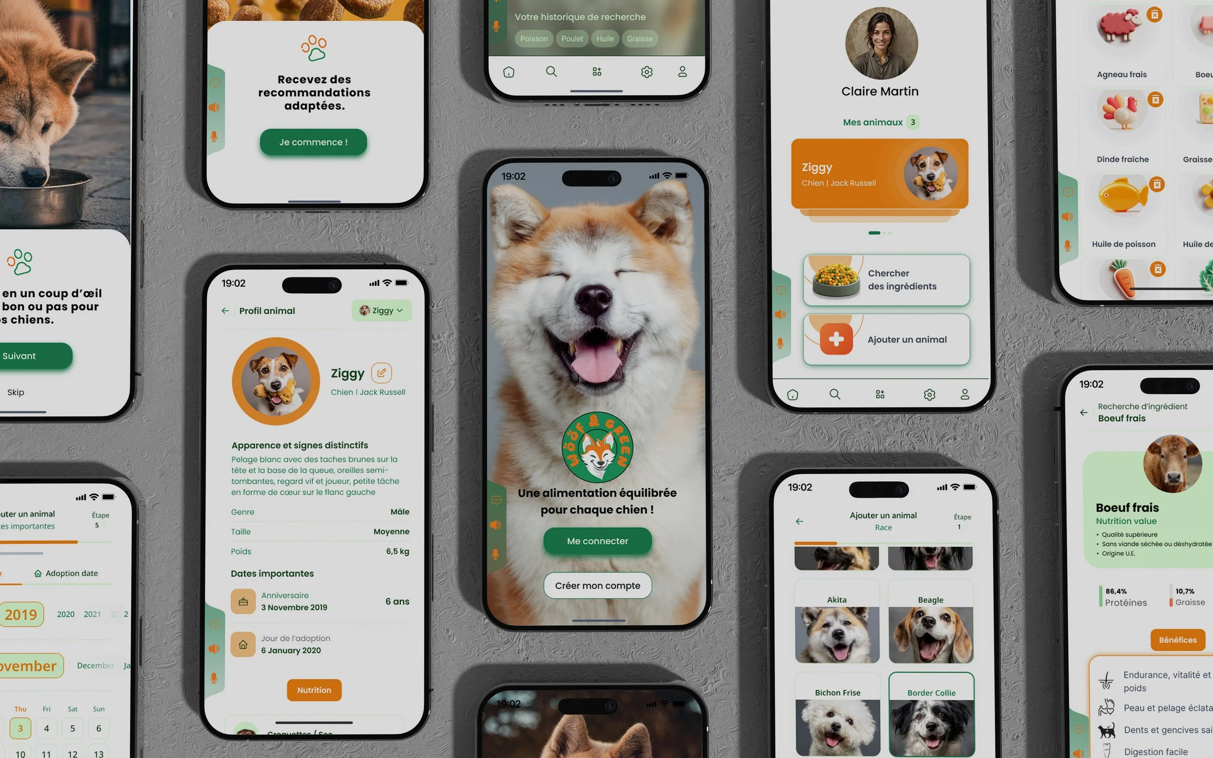
Final Design
Following initial user tests on the first version of the app, a complete redesign was carried out to enhance the overall experience and interface clarity.
Each screen has been rethought to ensure smoother navigation, simplified data entry, and improved content readability.
The visual interface has been streamlined and structured, with micro-interactions and illustrations adding coherence and engagement at every step.
This redesign reflects a focus on ergonomics and functional precision, providing an optimized journey for creating profiles and managing dietary recommendations.
User log studies and focus groups : understand how users use the website in their daily lives.
Accessibility tests : ensure that the application can be used by people with disabilities.
Post-use surveys : Get quick feedback after users interact with a new feature. Consider adding features.
Add a tutorial.
Reflections
& Take-aways
Impact :
The app makes users feel like Woof & Green is really thinking about how to meet their needs.
A quote from peer comments : “Access ingredient information is really simple and well done. I would definitely use this app for any food I buy for my dogs.”
What I learned :
When designing the Woof & Green app, I learned that the first ideas for the app are just the beginning of the process.
Usability studies and peer feedback influenced each iteration of the app design.
Accessibility Considerations:
Provided access to visually impaired users by adding alt text to images for screen readers.
Icons used to make navigation easier.
Support chat.
Possibility of voice search instead of using the keyboard.