Form Follows Design
Video tutorial platform for object design
Creating an optimized user experience and building a community of passionate designers
Overview
ROLE
Product Design (UX/UI)
Tools used:
Figma / Midjourney / Adobe Suite
Background
Form Follows Design is a business incubator and coworking space located in Brittany, dedicated to creators, designers and entrepreneurs. Its name reflects its commitment to the idea that form should follow function, a key philosophy in design.
The story of Form Follows Design begins with a clear vision: to create an environment where innovation in design and object creation can thrive.
Recently, they launched a community video platform on object design, offering tutorials, demonstrations and exchanges between creators to share skills and encourage innovation.
Problem
Users often have difficulty finding quality tutorials adapted to their level and specific interests in object design. In addition, they are looking for a space where they can not only learn, but also share their creations and interact with other design enthusiasts.
Project Goals
Providing an accessible and inspiring platform where object design creatives can easily find and follow quality video tutorials, share their own creations, and interact with an active community of enthusiasts to encourage learning and collaboration.
01 / Empathize - Exploring the user's needs
Overview
Research approach
Empathy Map
Research approach
I conducted interviews and analyzed user feedback to better understand the needs of creatives using the Form Follows Design site.
A key user category identified through this research: beginning designers looking to learn and get inspired by DIY projects, but having difficulty finding quality, organized tutorials. These users confirmed the need for a well-structured video tutorial platform.
The research also revealed a need for improved navigation and content discovery to make it easier to access relevant resources.
Pain points
Difficulty finding relevant tutorials
Lack of organization and structure
Variable quality of tutorials
Lack of effective search filters

03 / Ideate - Creating the framework
Overview
User flow
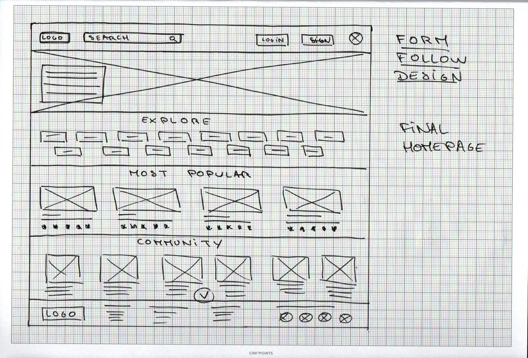
Paper wireframes
The site plan was designed to :
Organize content by defining structure.
Facilitate navigation by making the site intuitive and easy to use.
Plan technical requirements and necessary features.
Improve the user experience by allowing smooth and efficient navigation.
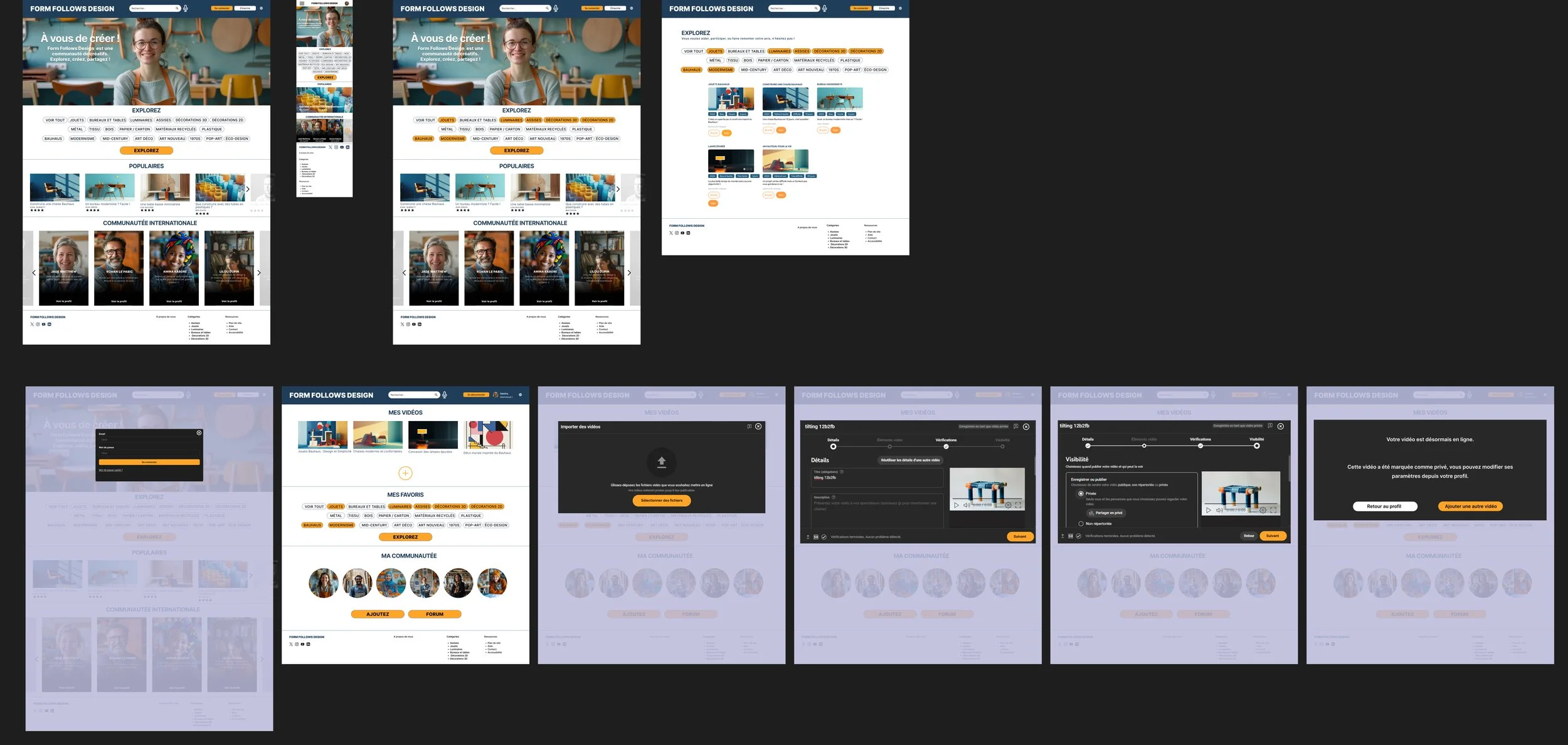
Wireframes
For the home screen, I focused my efforts on clear and intuitive navigation, with an emphasis on quick search by keywords and filters. The goal was to facilitate access to tutorials and projects while minimizing research time for users. This approach ensures that the functionalities integrated into the digital wireframes will be perfectly adapted to provide a smooth and satisfactory user experience.
Usability test plan and goal :
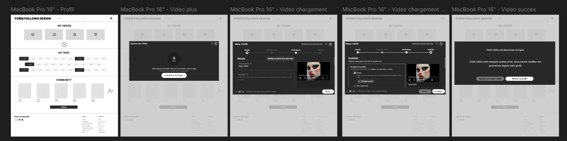
Using the full set of digital wireframes, I created a low-fidelity prototype. The main user flow I connected was to log in and add a video easily, so the prototype could be used in a usability study.
Type of study : Moderate usability study
Location : Form Follows Design company headquarters, Rennes region, France
Participants : 5
Duration : 1 hour
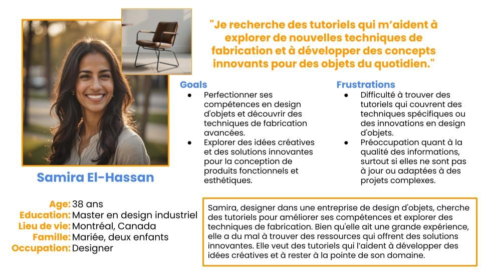
Persona development
Samira, a designer at an object design company, is looking for tutorials to improve her skills and explore manufacturing techniques. Although she has a lot of experience, she struggles to find resources that offer innovative solutions. She wants tutorials that help her develop creative ideas and stay on the cutting edge of her field.
Problems
How could we make it easier for users with varying skill levels to find and discover relevant design tutorials?
How could we offer detailed and contextual explanations of design techniques to enrich users' learning experience?
How could we make sharing creations, projects and feedback between community members both simple and engaging?


05 / Test - Time to test !
Overview
Usability test plan and goal
Usability test findings
04 / Prototype - Bringing the vision to life !
Overview
Wireframes
Lo-fi prototype
Tests
Wireframes and low fidelity prototype
As the initial design phase continued, I made sure to base the design of the screens on user feedback and research results. Here, search filters were crucial for users :
Highlighting videos with reviews allows users to quickly detect the highest quality videos.
Highlighting filters allows users to search quickly and easily.

Findings :
Excessive Information – Users found the home screen too cluttered. They preferred direct access to the main videos with detailed information elsewhere.
Confusing Navigation – The search function and filters were not intuitive enough, requiring simplification for better exploration of the tutorials.
Confusing Navigation – The search function and filters were not intuitive enough, requiring simplification for better exploration of the tutorials.
Branding
While thinking about the concept of the video platform, I realized the importance of creating a space where creators can easily learn and share their design skills. So I wanted to design a logo that reflects innovation, creativity and community.
After exploring various concepts, I chose modern colors and a dynamic visual that evoke elegance, functionality and dynamism. This visual identity is designed to inspire creators and provide a captivating and professional experience.
02 / Define - Establishing the user's needs and problems
Overview
Persona development
Problem statements
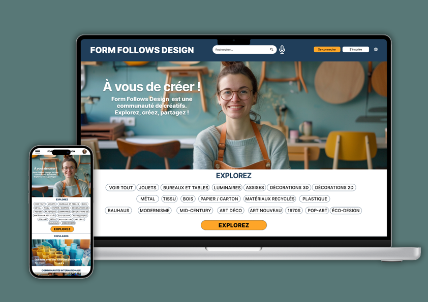
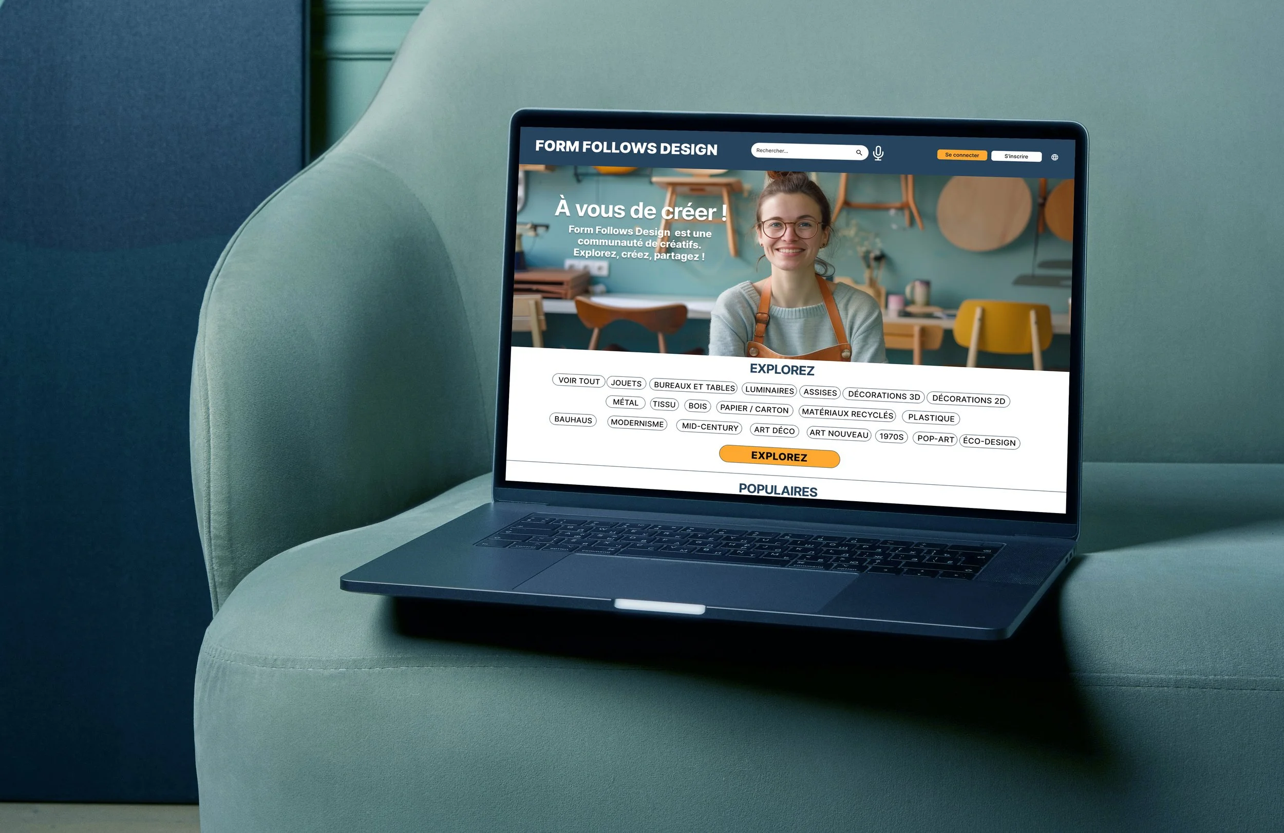
Final Design
Early designs allowed for searching, but after the usability studies, I simplified some aspects and emphasized the filters more.
I also revised the design so that users see more accessibility options when they first come to the screen (voice search, language change).
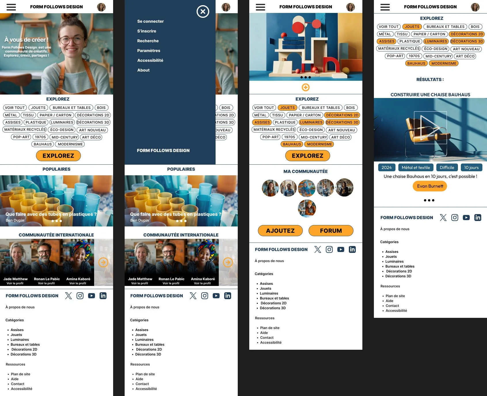
Resizing the images helped draw attention to important aspects of the website, such as the international design community it represents.
The profile has been clarified thanks to the images, and the flow of adding a video as well.
User log studies and focus groups : understand how users use the website in their daily lives.
Accessibility tests : ensure that the application can be used by people with disabilities, and revise the site if necessary.
Post-use surveys : Get quick feedback after users interact with a new feature. Consider adding features.
Reflections & Take-aways
Impact :
This website gives users the impression that Form Follows Design really thinks about how to meet their specific needs in terms of access to object design video tutorials. A quote : “ It’s simple and well done. I would definitely use this site even if I am a Sunday DIYer! ”
What I learned :
When designing the website, I learned that the first ideas are just the beginning of the process, even if it took fewer iterations than my first project. Usability studies and peer feedback influenced the site design.
Responsive website :
Hi-fi prototype :
The final high-fidelity prototype featured cleaner user flows for global search and adding a video.
It also met user needs for clarity of information, as well as greater personalization.